Prompt
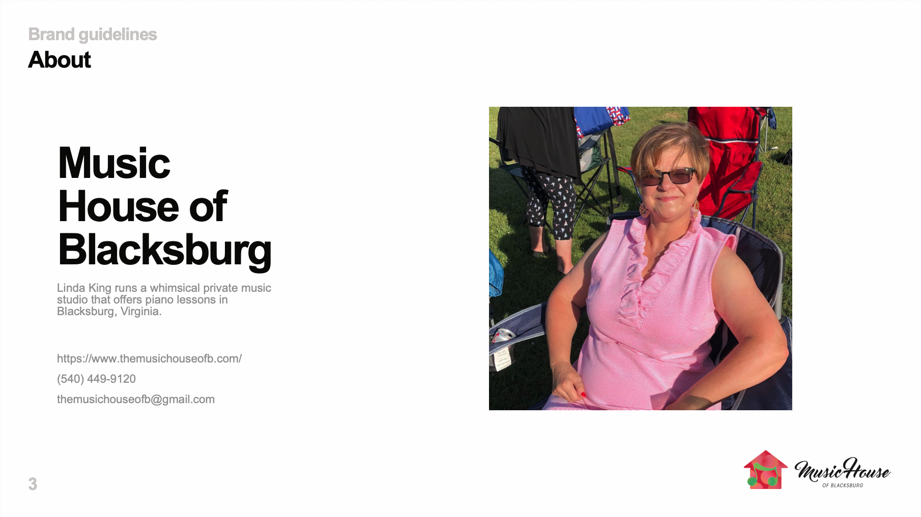
This is the logo and brand design for Music House of Blacksburg, a private music studio that offers piano lessons in Blacksburg, Virginia.
The client’s goal was to create a cohesive brand for signage and online marketing. Her audience is primarily moms, parents of kids. She was looking for something thoughtful, professional, fun, encouraging.
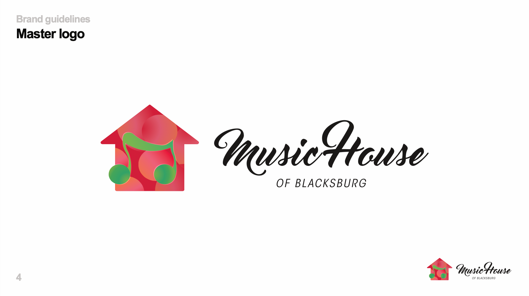
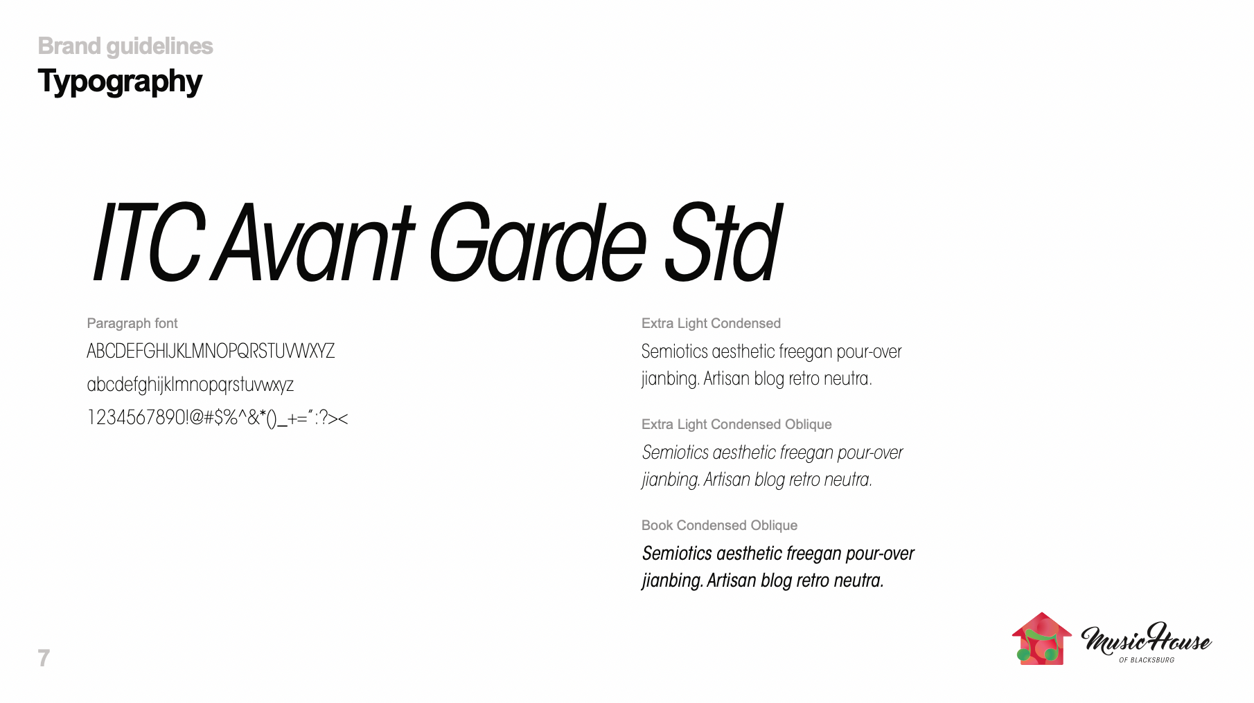
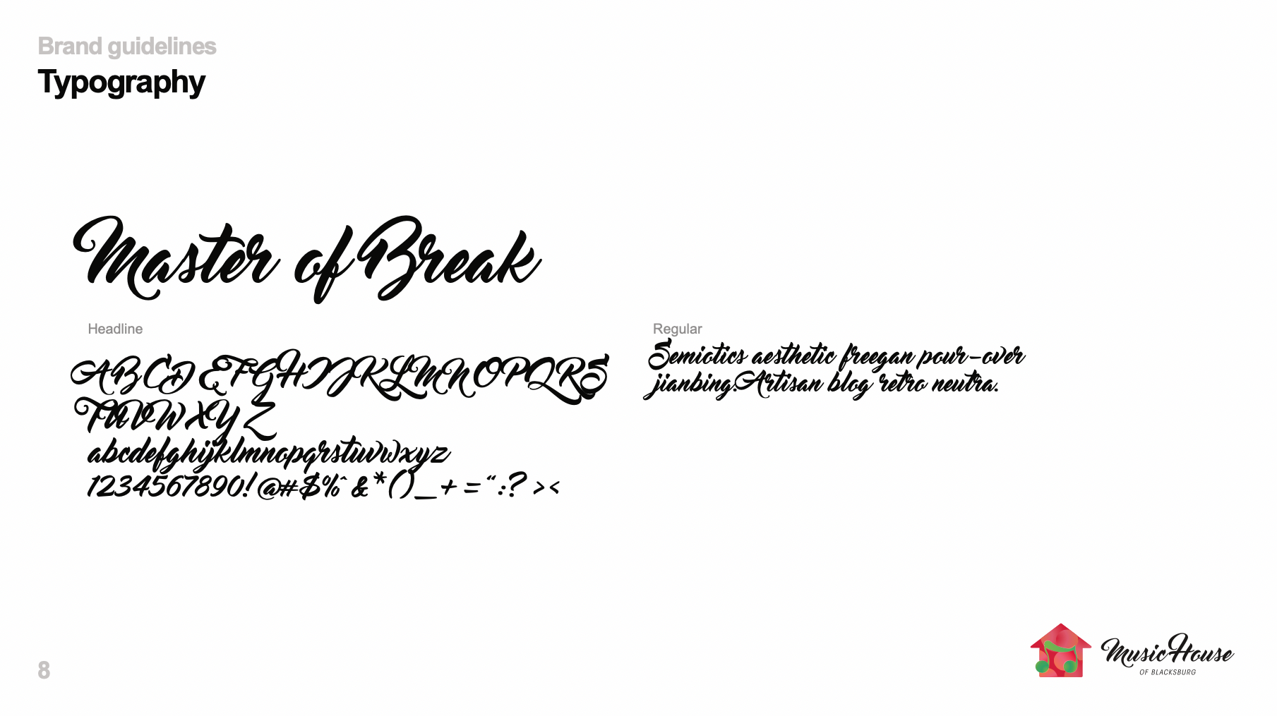
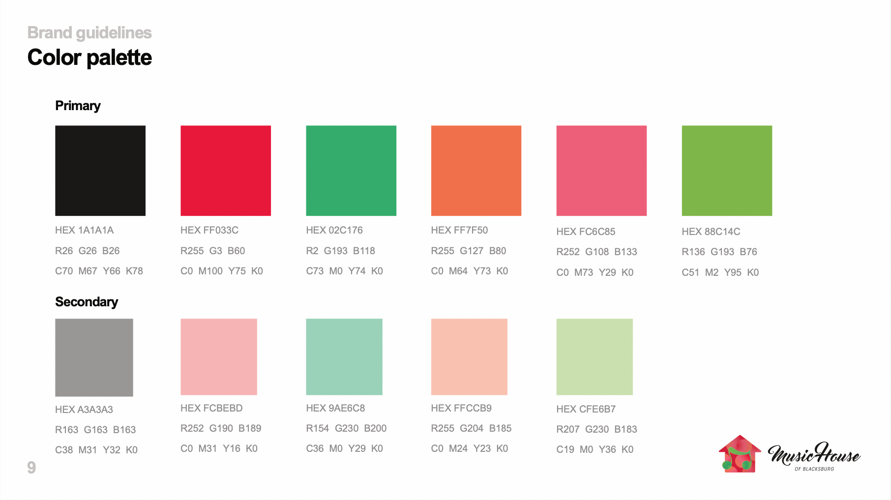
Her requested colors scheme was: poppy red, orange, and apple green. For fonts, she wanted to use a script font similar to Lobster. For imagery, she requested eighth note/house elements.
Process
Research, Fonts, & Colors


I started by looking up color inspiration and lobster font alternatives to help me communicate with the client about what she was imagining. She obviously had a vision in her head which guided her choices as we went back and forth sharing screenshots. We settled on a color scheme and a script font + condensed sans-serif font combination.

Music house logo references saved from Google
Next, I reviewed current trends, trends among businesses in her industry, and saved every single music note / house logo concept that I liked. Through our process of sharing inspiration back and forth, we landed on the word “whimsical” which ended up being a driving theme for her project.
Some of my first drafts were too sketchy, hand-drawn and detailed for the client. We determined that for our look & feel, we were going for something more contemporary and minimalist for the imagery. The whimsical in this project comes through in her bright, bright color scheme.
Concepts
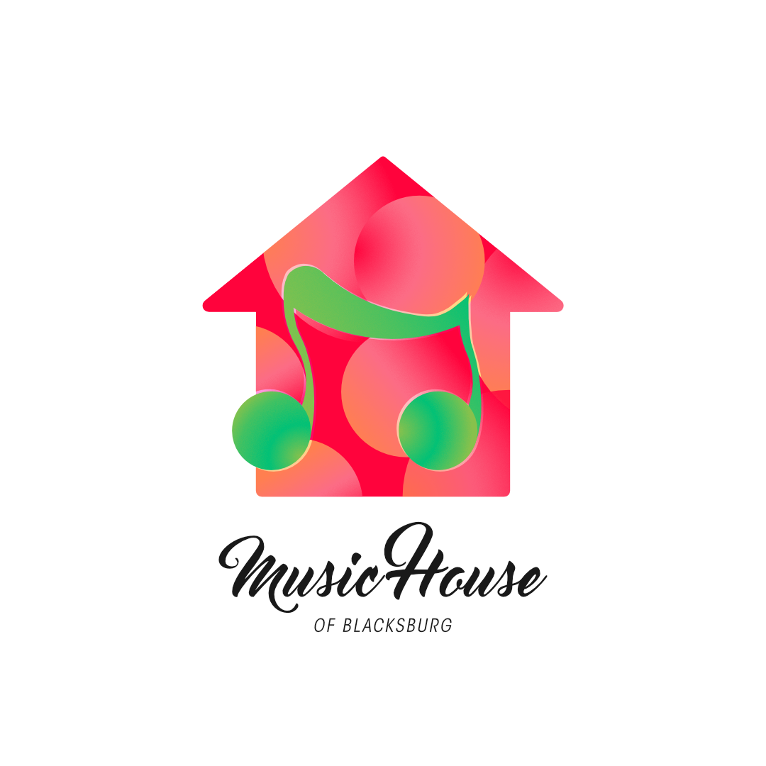
Using an eighth note in conjunction with a house shape was a given. What I had to figure out is how to make this imagery look good using the super bright color scheme we chose.
I started with a straight and boxy pair of icons and tried a variety of methods to combine these two icons using negative space. The help create the whimsical vibes, this straight and boxy design became swoosh-y and curvy.


The client was receptive to the inspiration I shared which made use of highly saturated gradients, so I used rule of thirds to create the colorful gradient bubble pattern featured as the house icon’s background. The circles overlap and sort of fit in with the swoosh-y lines of the eighth note.
We had several different directions we could go using the same bright colors and icons. My personal favorite is the one that focuses on either the pink/orange scheme or the green/turquoise scheme and then uses negative space for contrast.


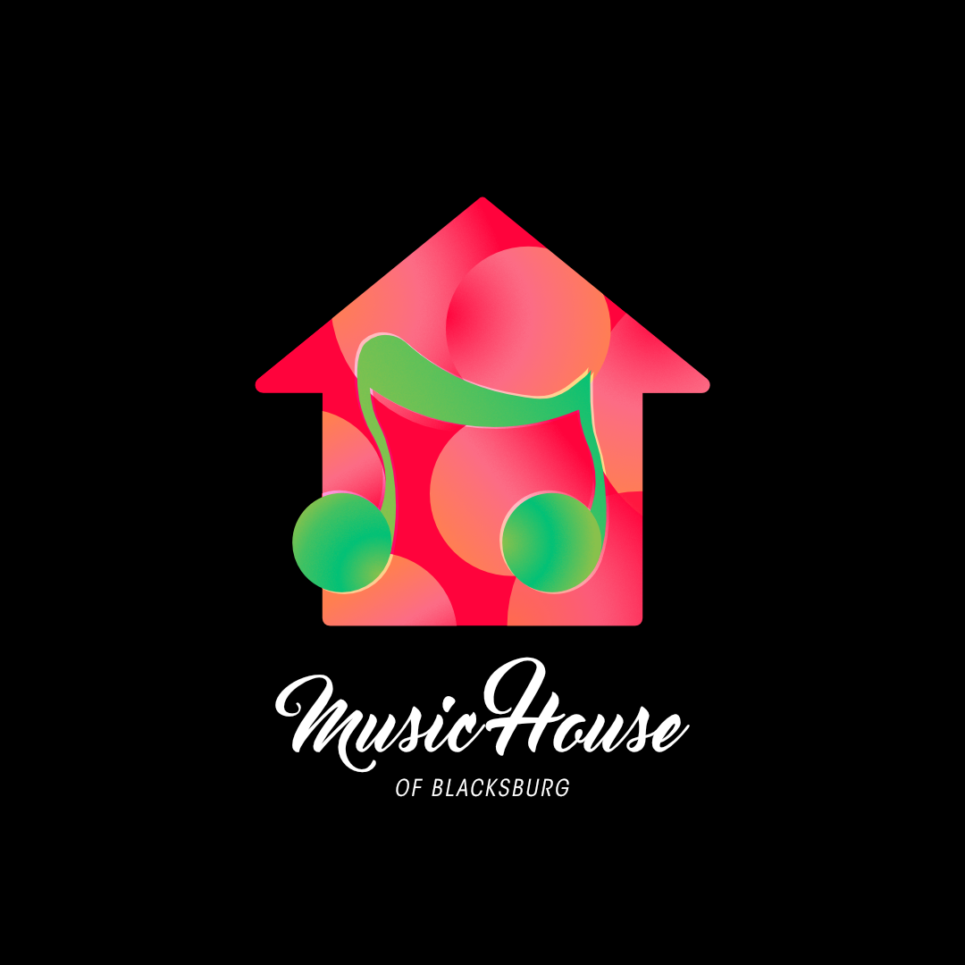
The client really preferred having both the green scheme and the pink/orange scheme together in all her variations, so what we went with for the final was just that.
In order to create contrast between the music note shape and the house shape, I first tried a handful of shadow and glow effects. They didn’t sit right with us though. For the final, we agreed upon this version where I created a shadow behind the music note with the music note shape and then set opacity to color dodge.
We combined our icon with our text and presto!
The Best Part: Variations & Source Files
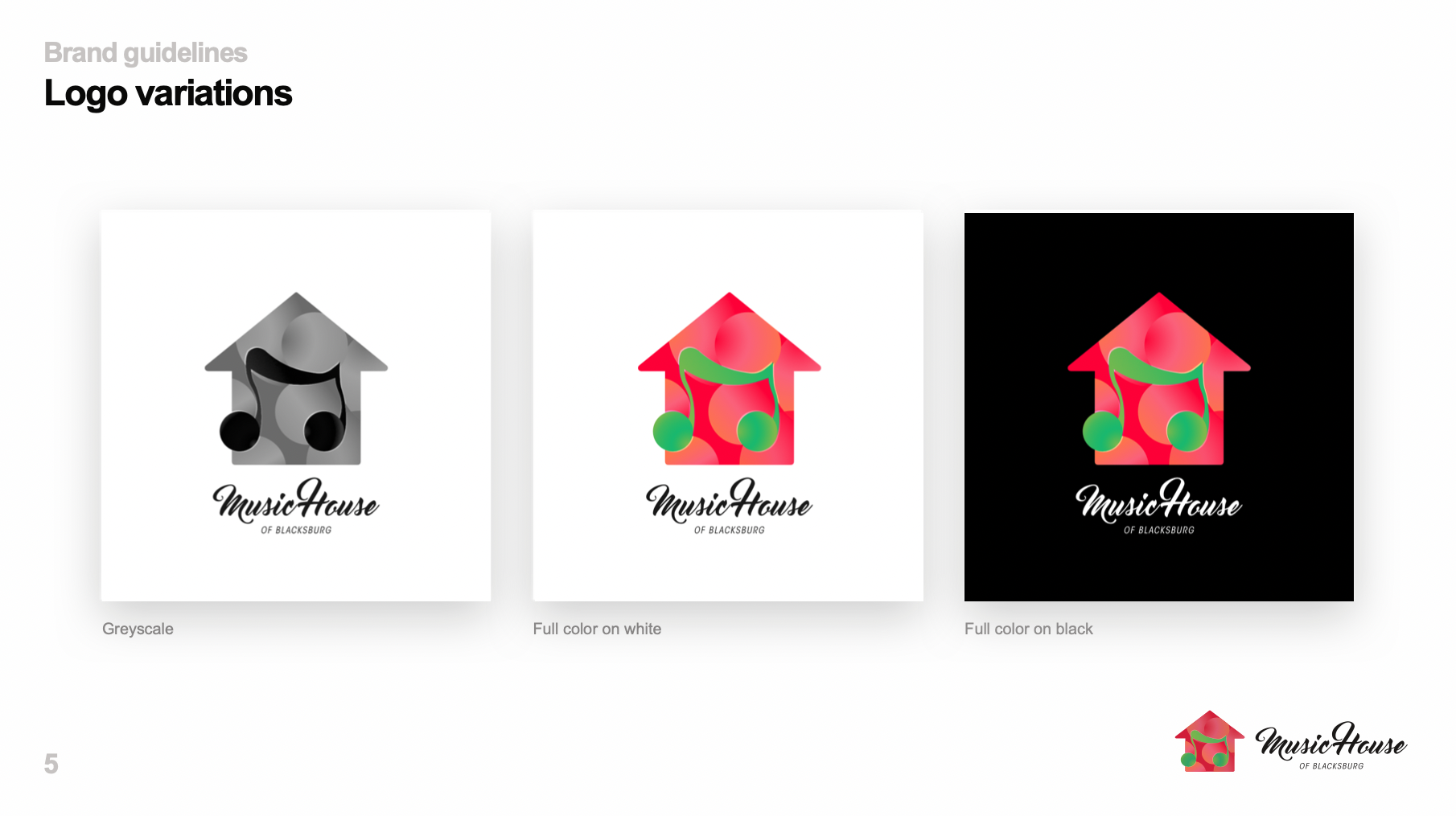
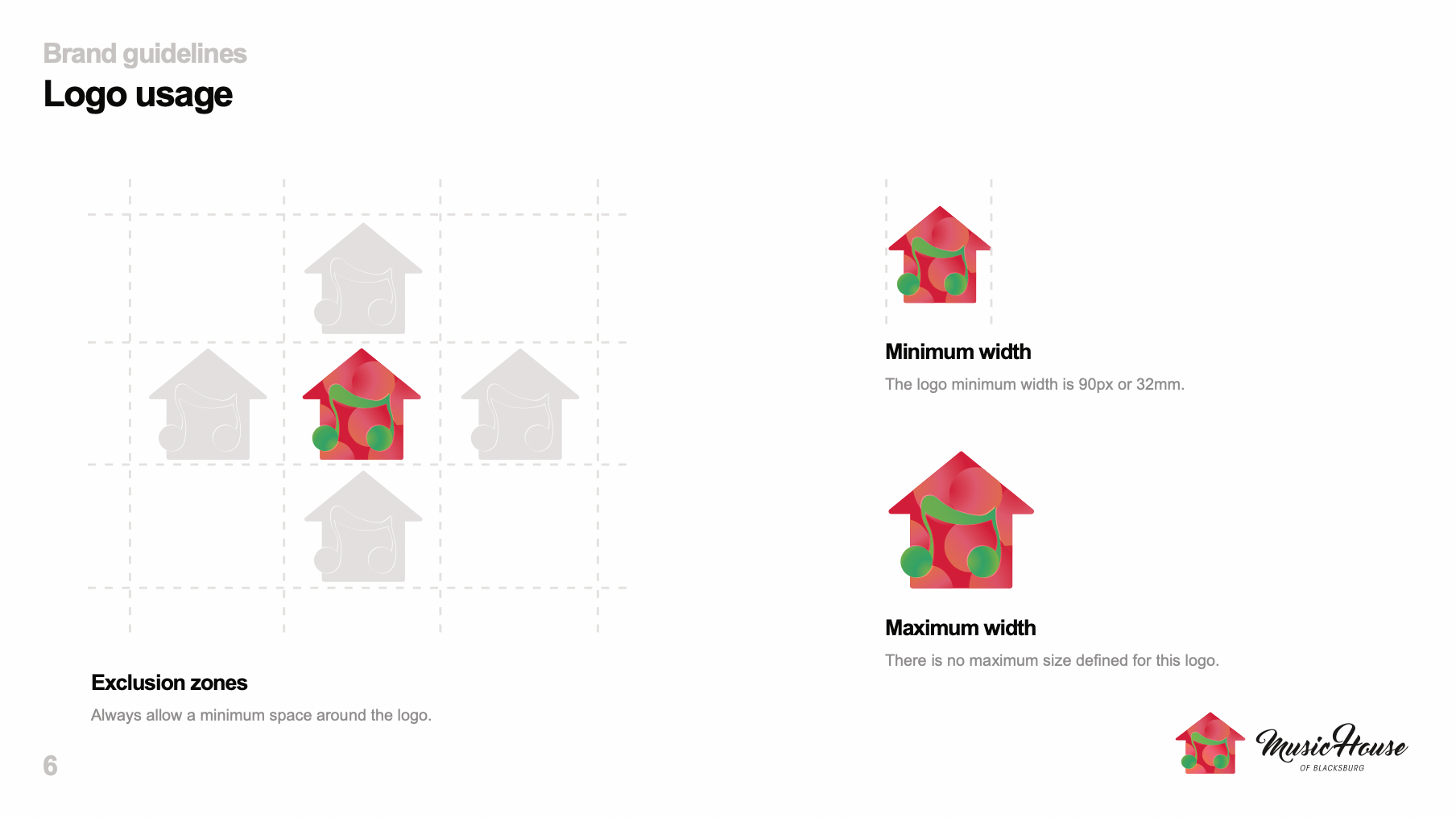
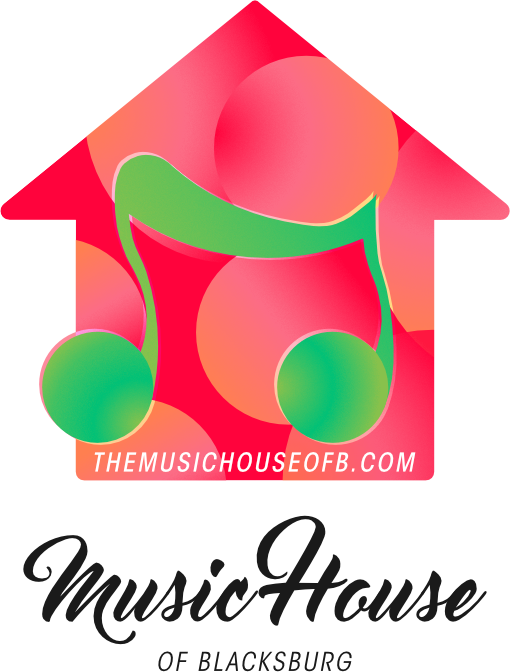
With me, you’ll never have a lack of variations of your logo. You’ll also never go without the source files! These two things are so important for the future and longevity of any brand project.
My bubbles make a great background for her logo design. To demonstrate how her brand could be used in conjunction with complimentary elements, I generated a couple of quick business card concepts for her to go in her brand guide.


Brand Guide