Prompt
This is the re-brand of New River Moving Arts. During this process I was responsible not only for the new logo design for 2-brands-in-one, but also for contributing to the re-naming process for the business.
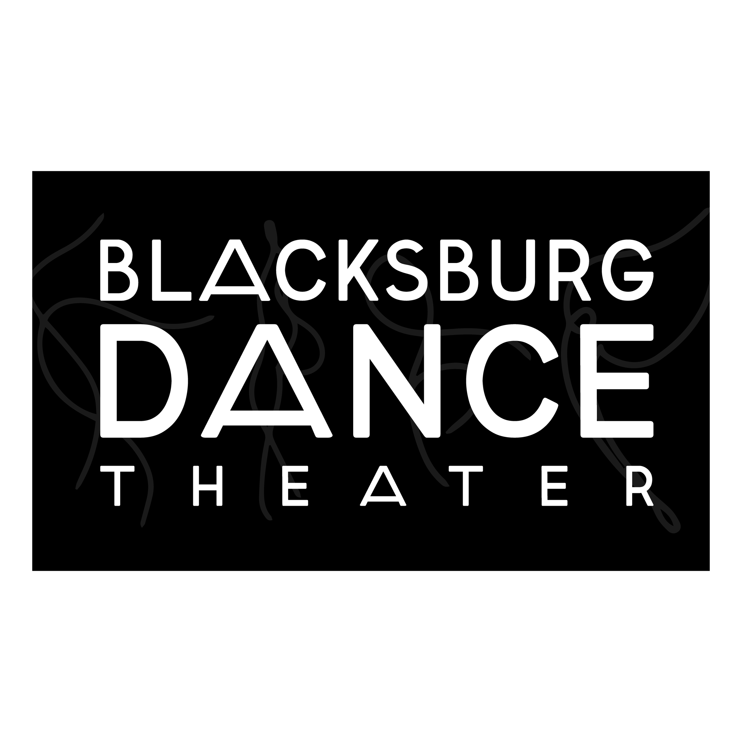
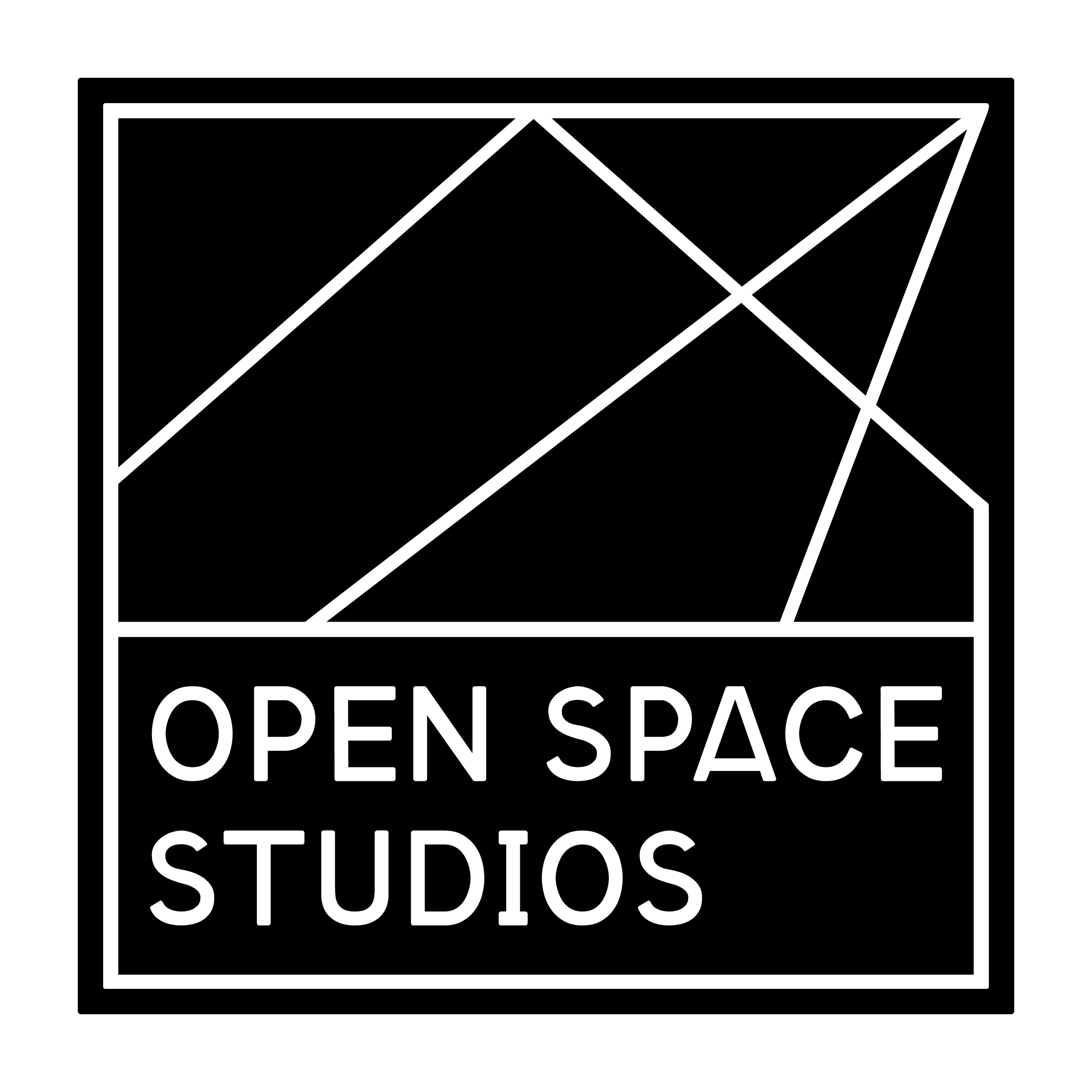
Blacksburg Dance Theater & Open Space Studios (formerly known as New River Moving Arts) is a multifaceted studio consisting of: dance, Pilates, martial arts, academics, and music education.
Process
Research
The first angle I like to look at any logo/brand design problem from is current trends. I invite all my clients take a look at some recent articles from around the web and prompt them to let me know if anything stands out. It’s especially helpful during this initial part of the process to know what the client likes as well as what they DON’T like. First impressions and honest comments are crucial to this part of the process.
Next, we survey the market's various dance logos, collaborative space logo, community logos… Any search keywords that are relevant to the project at hand.
I’ll save things I like as well things I don’t like. These give me ideas of design cues to try. It’s like of like logo build-a-bear — a mix-match of little details that together represent your space’s unique approach to the industry.
We were feeling like the icons of a person’s body in any sort of dance position were super overused in the dance sphere, but we were drawn to the geometric or abstract shapes that help convey movement.
For the community factor, we were feeling drawn to circles or repetitive/symmetrical patterns.
For look & feel, we were going for something modern and contemporary. We are avoiding anything that feels too childish or playful, while also avoiding anything that’s too academic or corporate.
Concepts
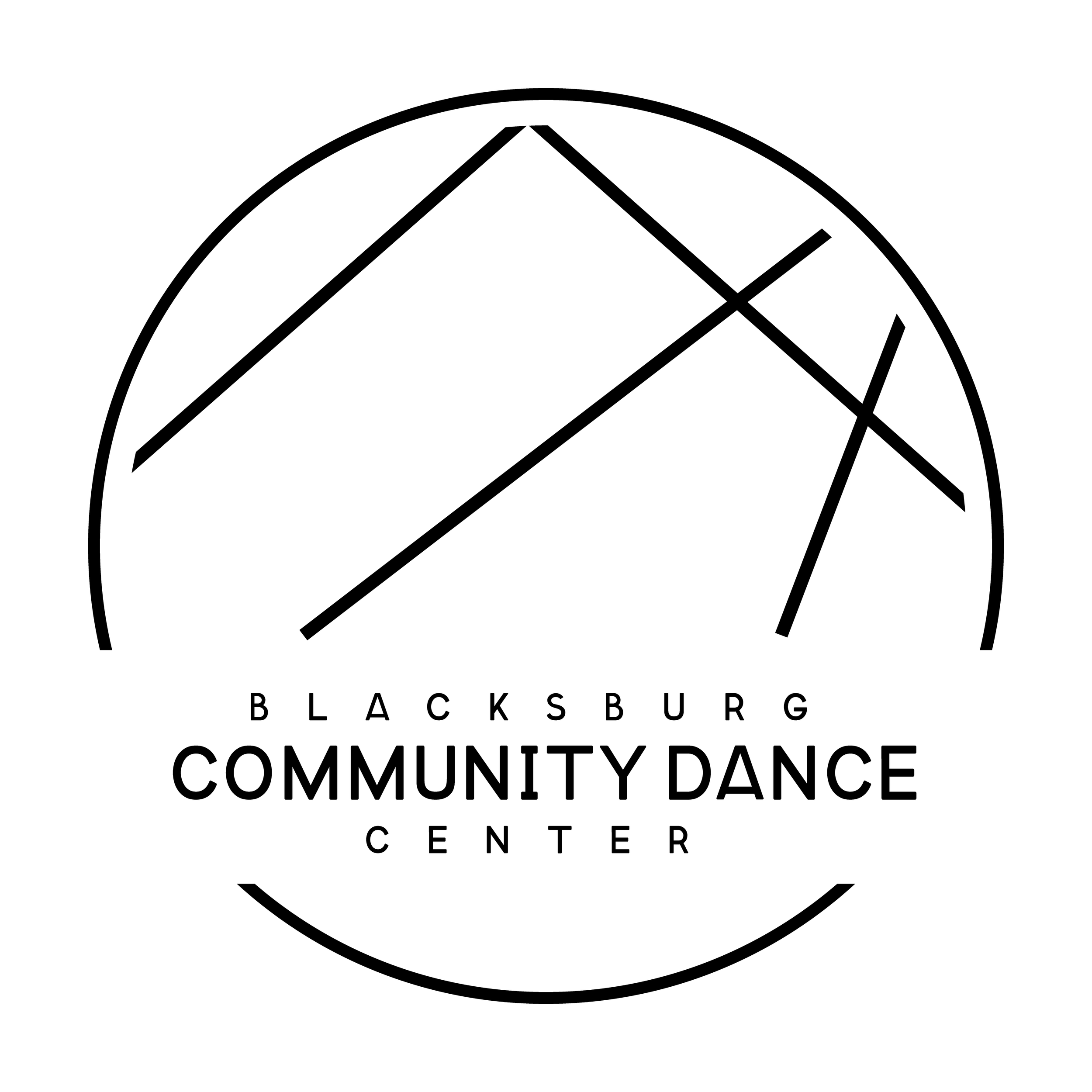
For this particular project, I jumped straight into sketches very quickly after research. One of my very first “this felt right” sketches made it into our final logo design. This strategy was helpful for work-shopping the re-name, since that was still undecided at this point.
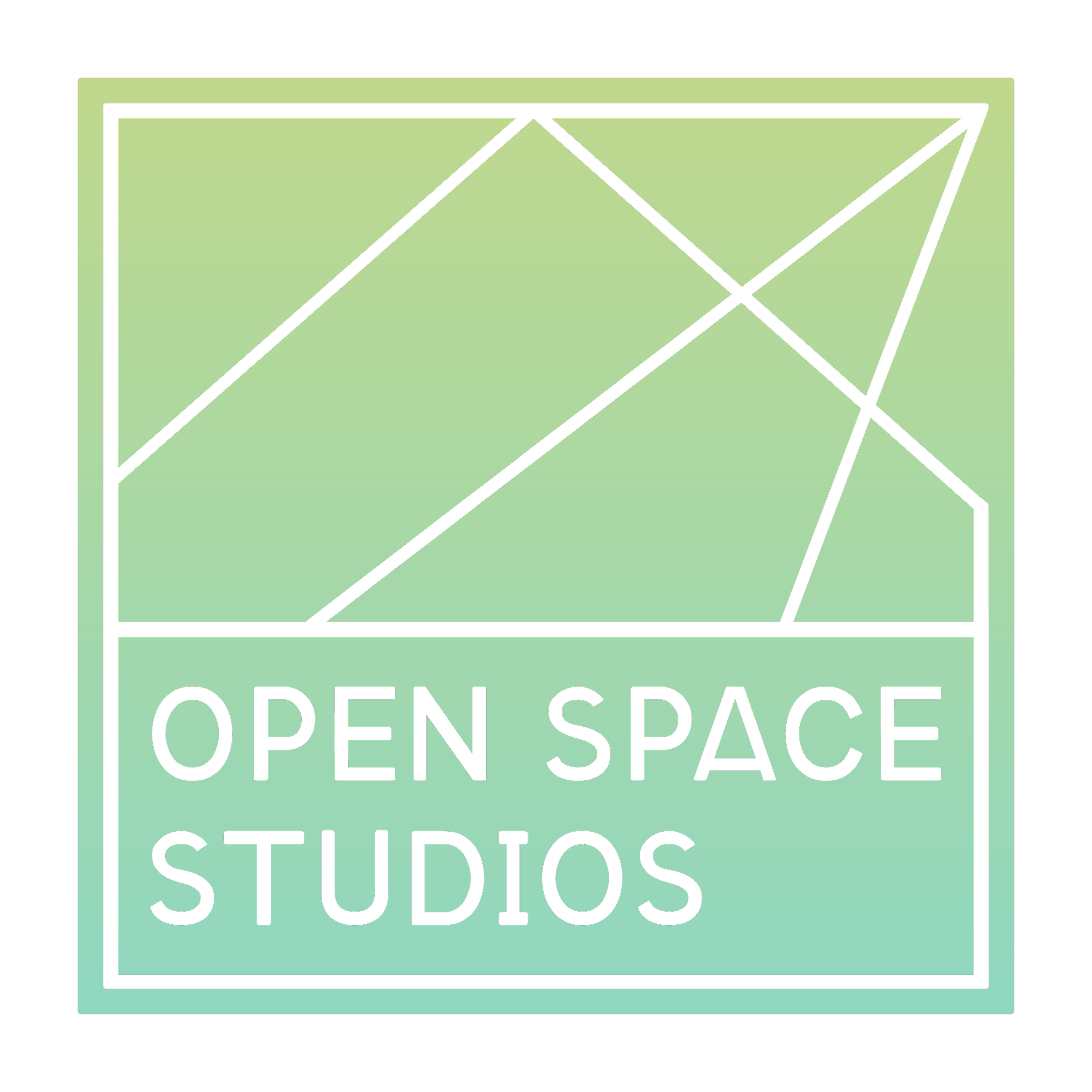
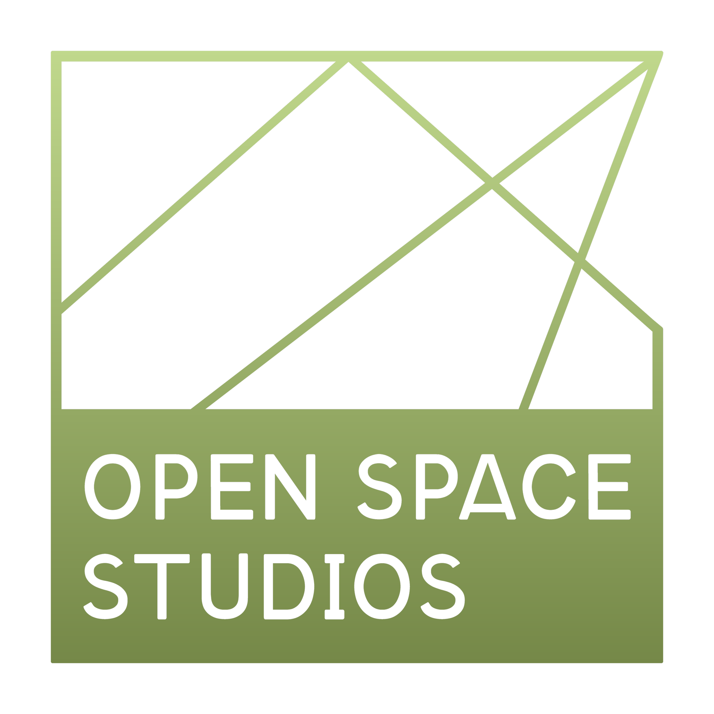
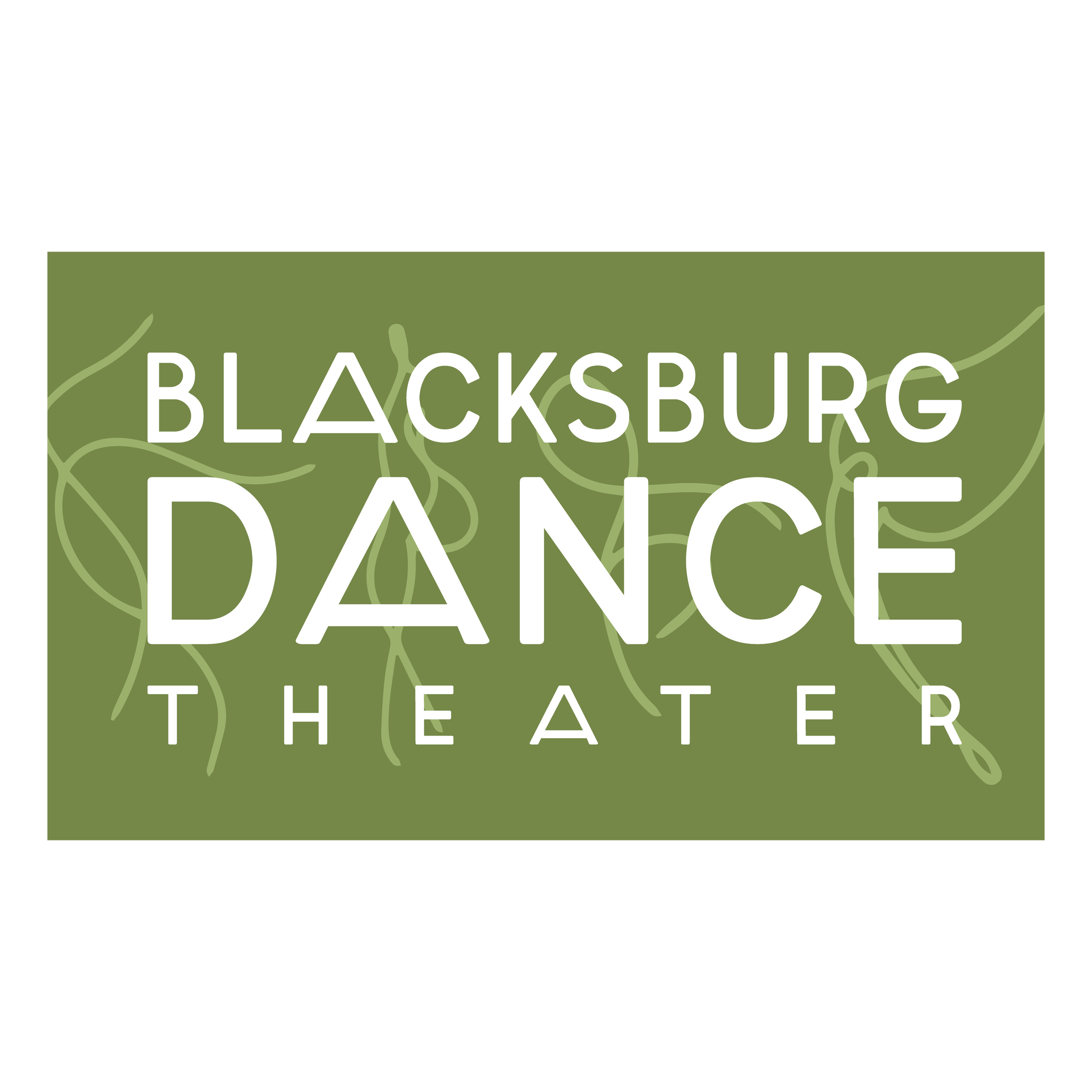
The inspiration behind my abstract lines is the architecture of the Blacksburg Dance Theater building. It has an entry way that’s triangle-like with beams. The windows inside are a large, square grid that lets in a lot of light. The box and triangle part of the logo symbolize the building, while the other diagonal lines remind me of / symbolize a ray of light beaming in through the windows.
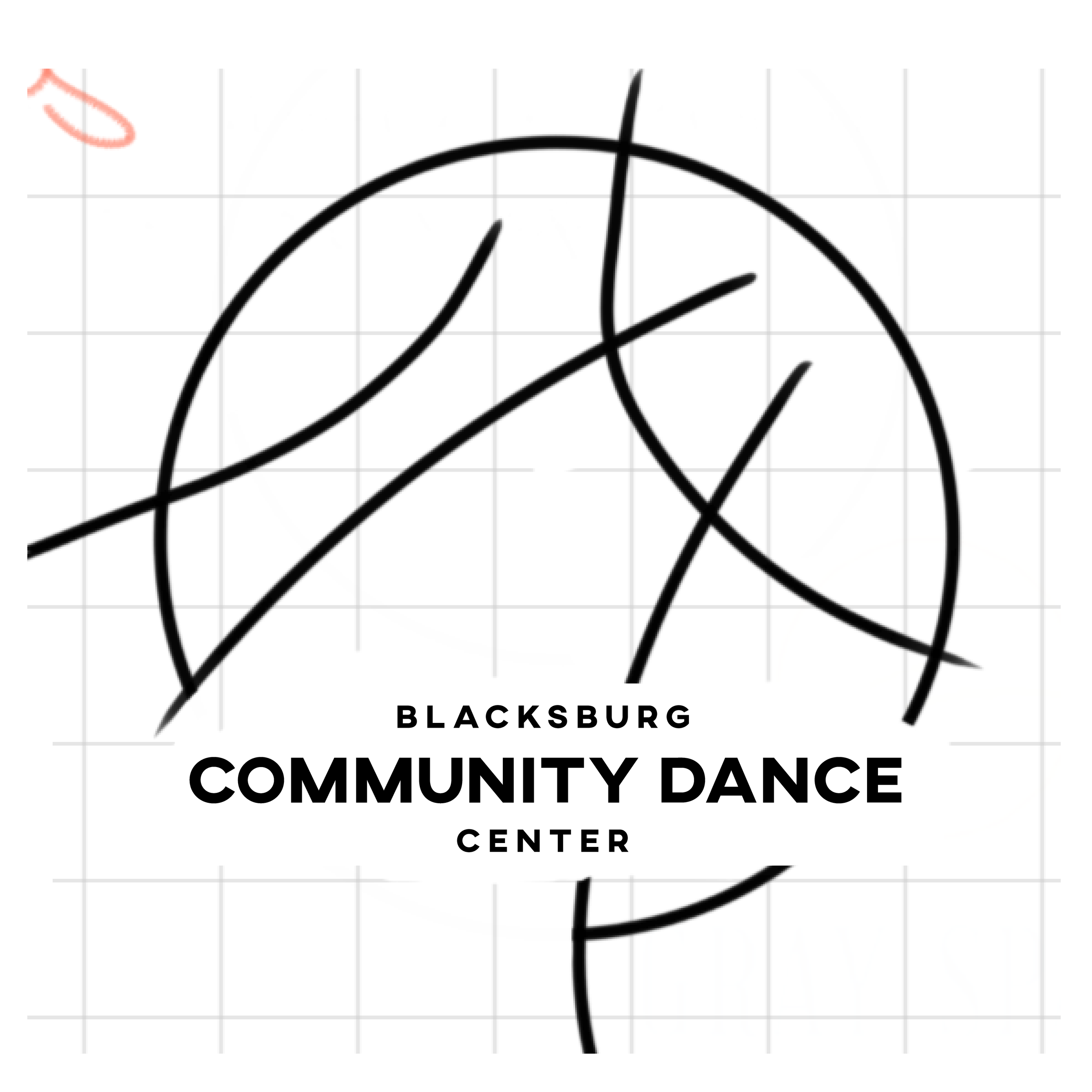
A lot of these sketches are a hot mess, but I’m including them so future potential clients know roughly what to expect from my particular workflow.


Fonts & Colors


The choice of font came about similarly to my sketches. When I tested this one out with our design, we knew immediately that it was the one!
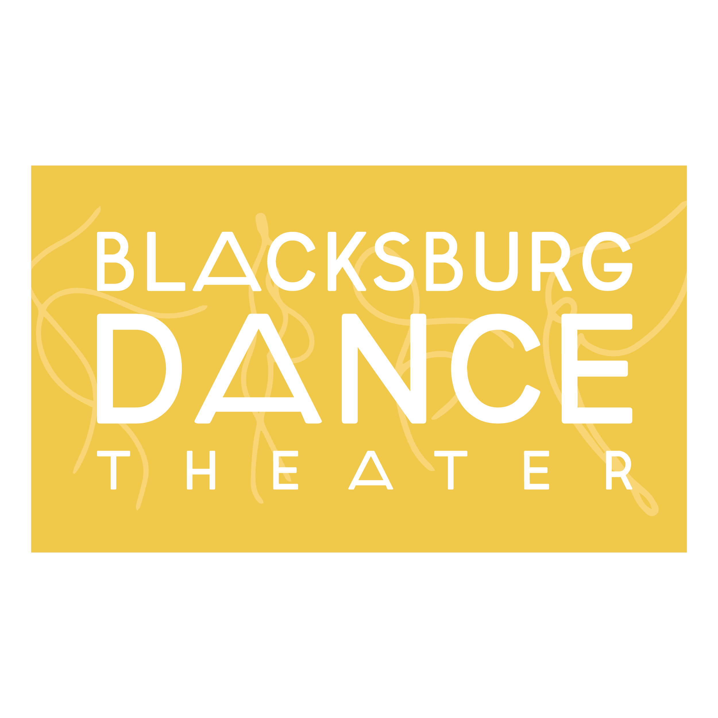
For the Open Space Studios logo, the font is left justified and left as is. For the Blacksburg Dance Theater logo, we ended up stretching the letter A’s to led to the mountains and movement vibe.
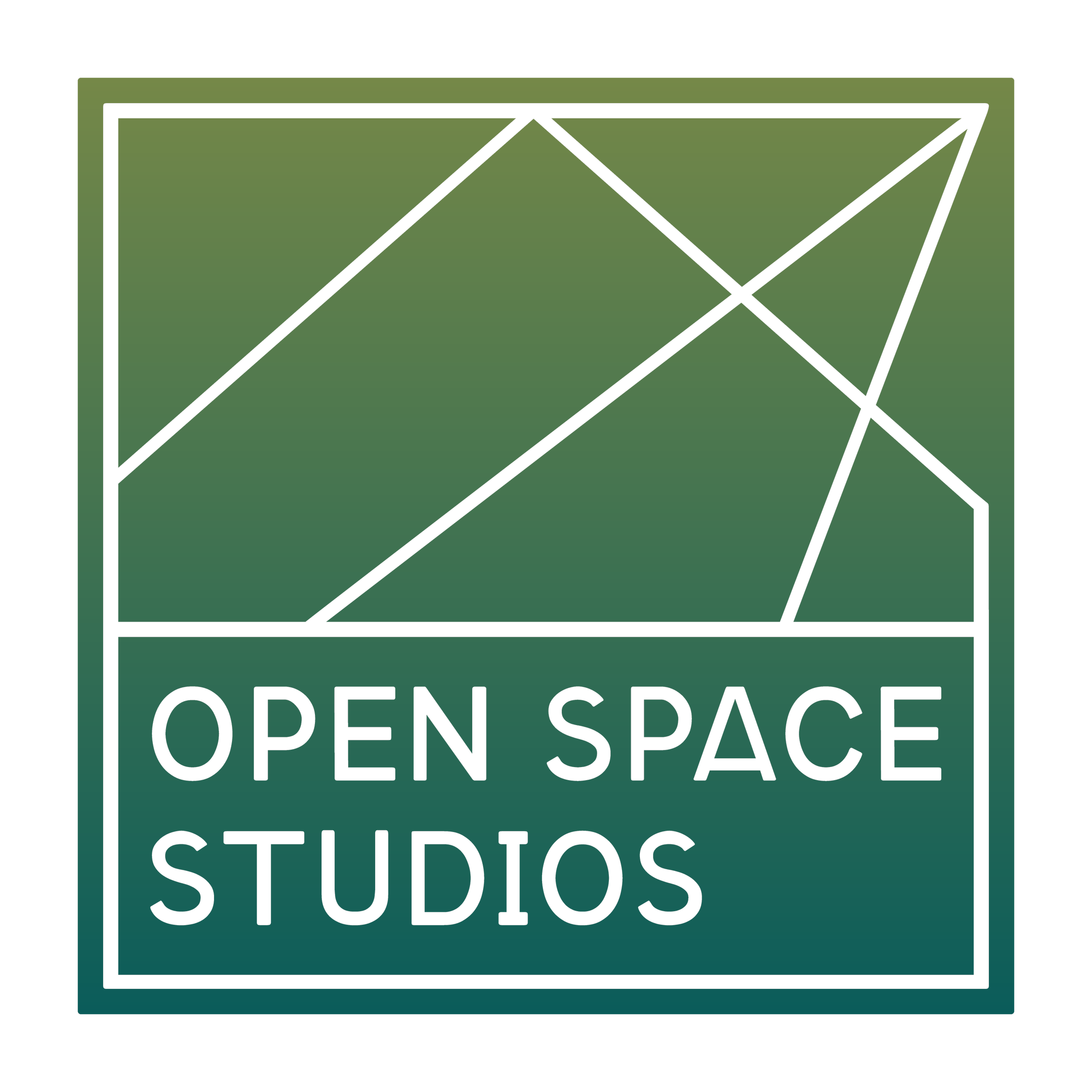
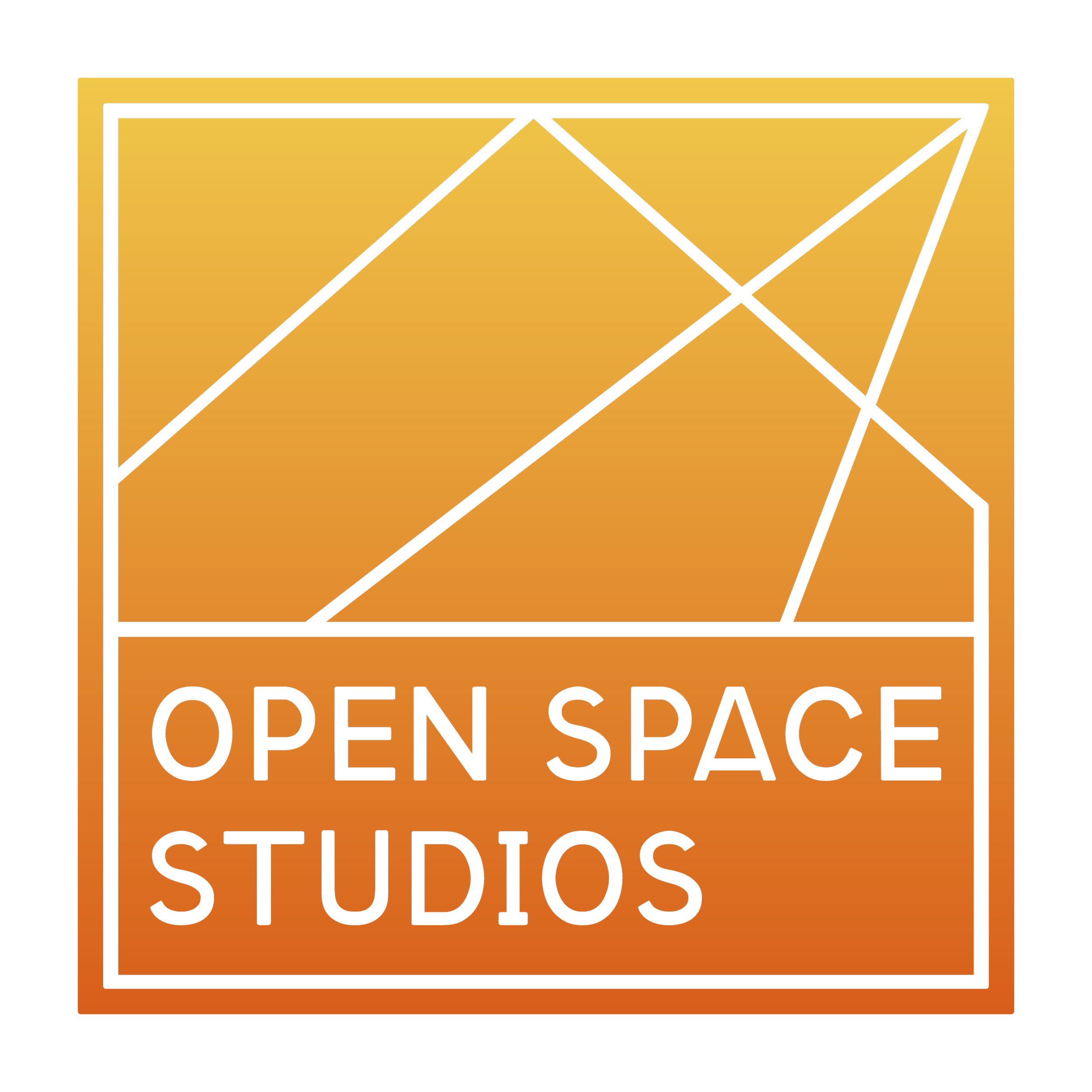
The client sent over some photos of an outdoor performance and the lobby at Blacksburg Dance Theater to inspire the color palette.
Variations & Source Files — The Best Part!
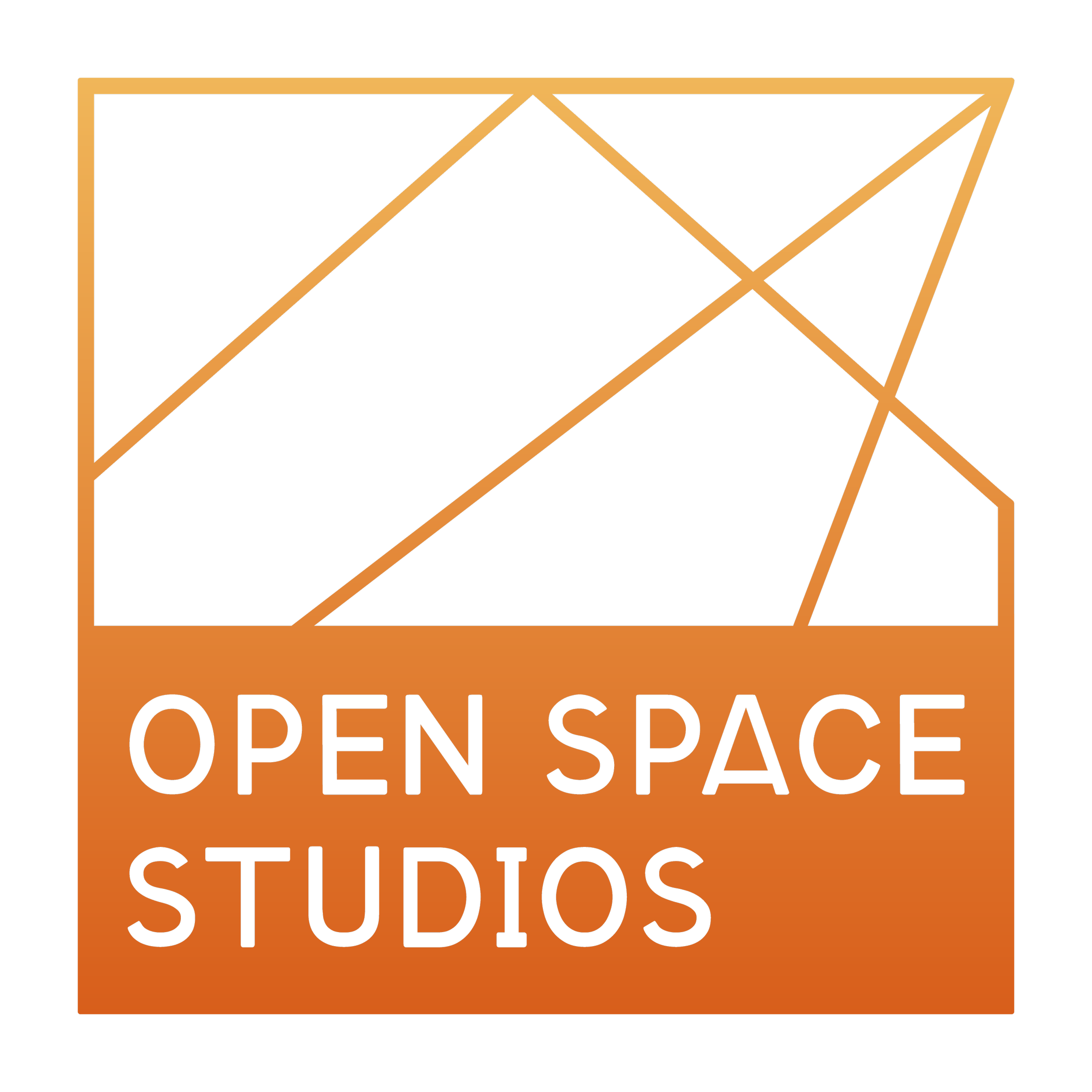
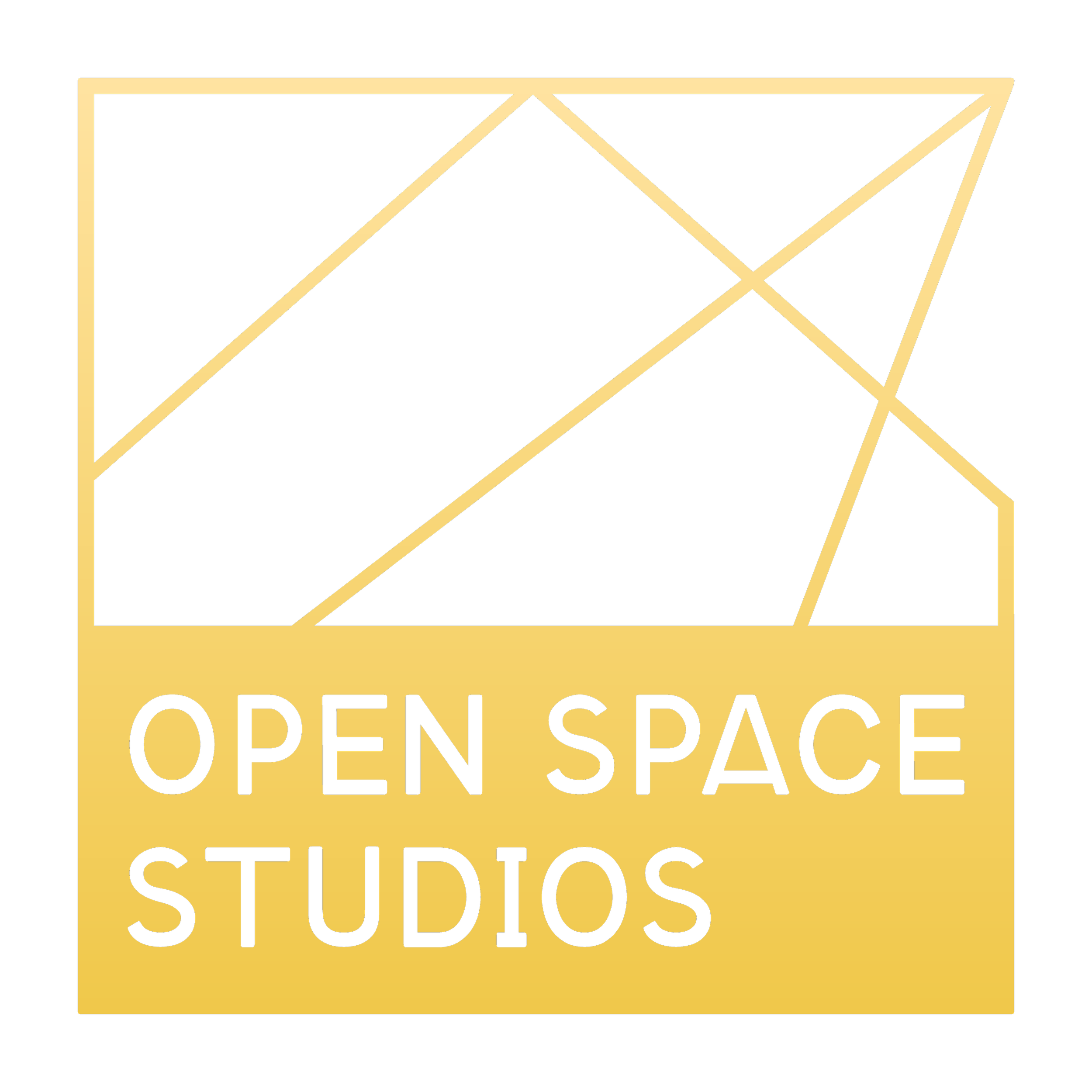
With me, you’ll never have a lack of variations of your logo. You’ll also never go without the source files! These two things are so important for the future and longevity of any brand project.
While my fun little dancer doodles didn’t quite make it in as a crucial part of either logotype, we still found a unique way to incorporate them into the colorful variations. They could also be used in the future to accompany other brand designs, ads, flyers, posters, etc.