Prompt
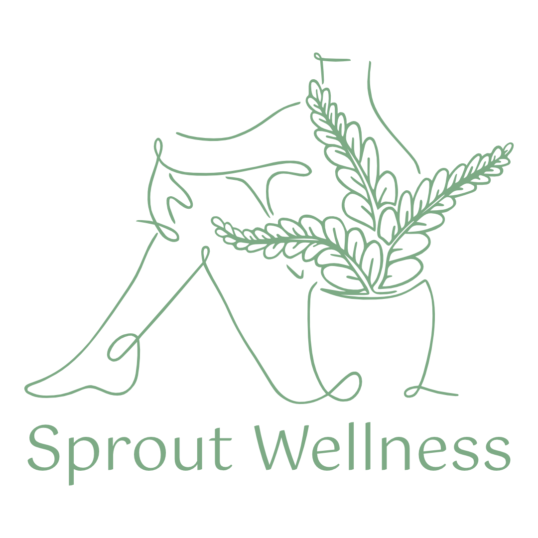
This is the logo and brand design for Sprout Wellness, an inclusive wellness coach offering online personal training for people of all bodies and abilities who want to reach their health and wellness goals with gentle support and guidance in Blacksburg, Virginia.

The client aimed to create a cohesive brand for her website and social media marketing. Her audience is primarily women. Although she is in the fitness industry, she avoids words like “fit,” “power,” and “boot camp” because her style of wellness coaching appeals to those who aren’t necessarily looking to achieve a “fit” body; her priority is overall health and wellness.
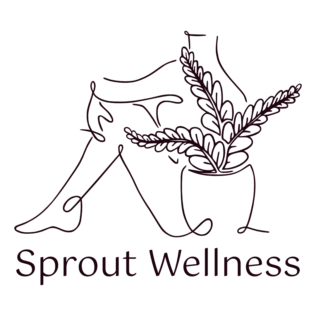
For imagery, she wanted again to avoid any “fit” bodies or recognizable yoga poses and somehow include a plant. During our conversations about concepts, the client suggested a woman in a grounding pose and noted that any plant imagery needs a little bit of a modern twist because it is frequently overused in the wellness space.
Process
Inspiration
While adding to our inspiration board, we were drawn to the style where very few strokes are used to create a minimalist outline. We were incredibly excited about a particular piece of inspiration I found on Etsy. So, I went ahead and purchased that illustration for posterity and then re-drew it to fit my needs.
After researching different plants and their meanings, we used a fern. I didn’t love my initial fern drawings, so I sent over the following document to my illustrator, Berkeley. Berkeley is great with botanical and anatomical accuracy due to her experience drawing for a tattoo studio, so she could turn the idea I had in my head into reality.

The prompt that we sent off to the illustrator.

The Final Logo
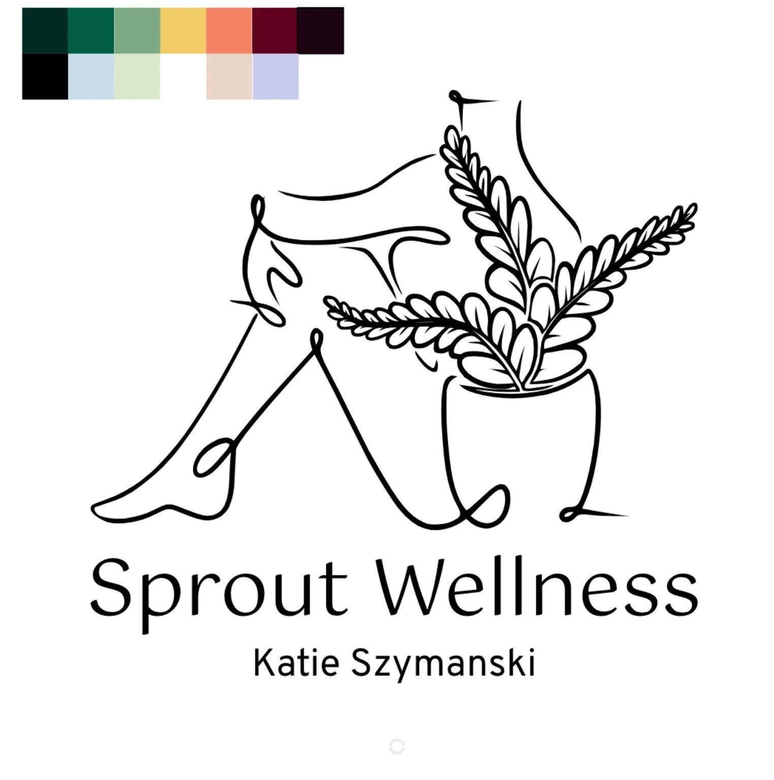
Colors
When Katie described her ideal color scheme, Maggie Perrin-Key’s art came to mind! She was going for earthy tones with pops of color. I borrowed from her unique way of combining jewel tones and pastels to create Katie’s color palette.

Fonts


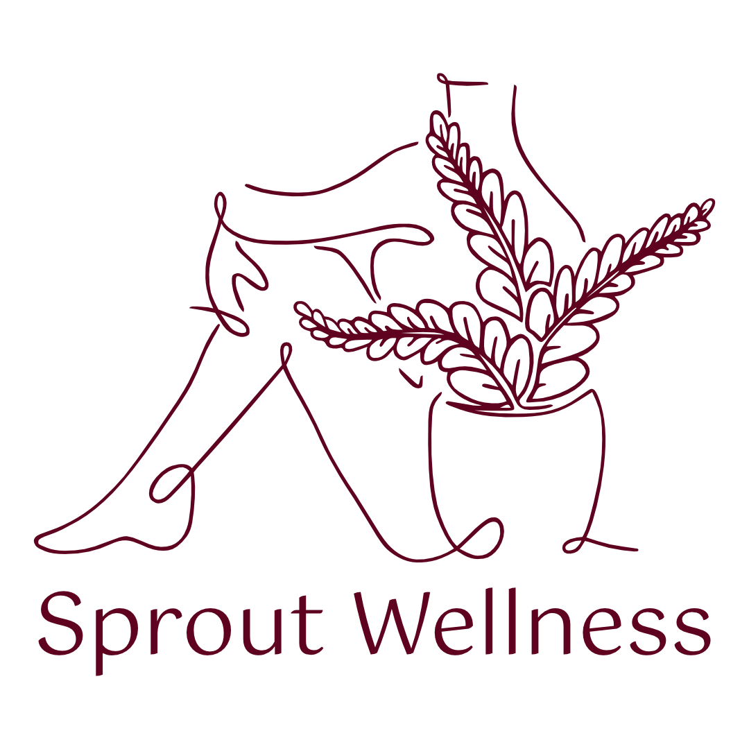
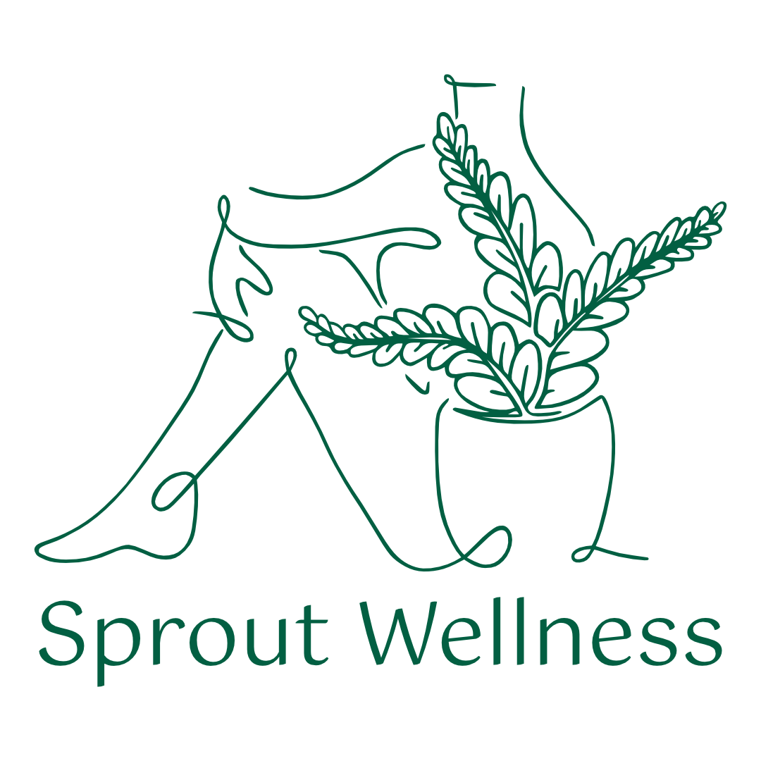
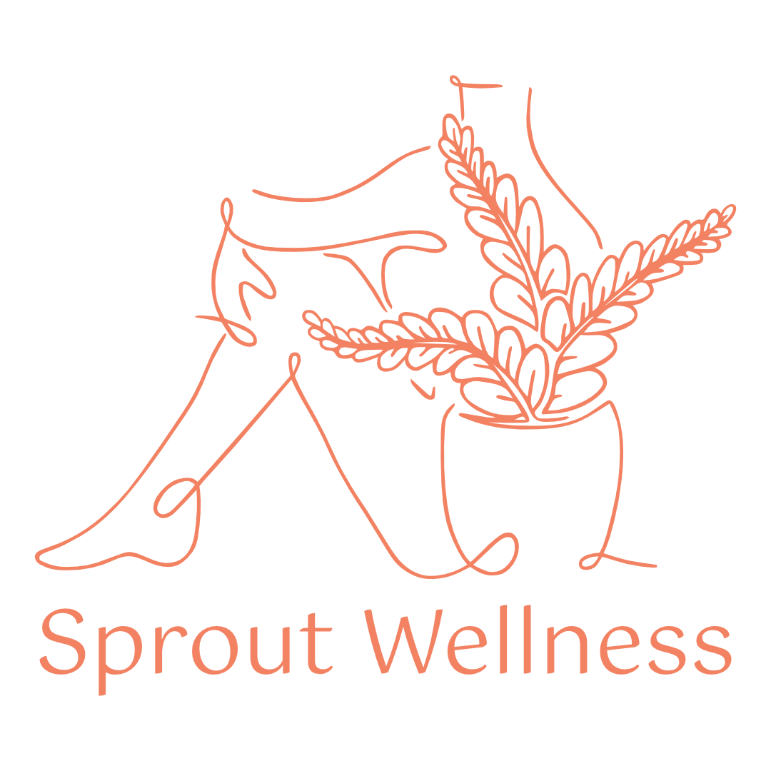
Variations